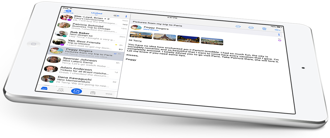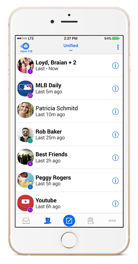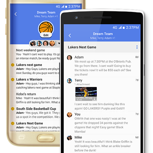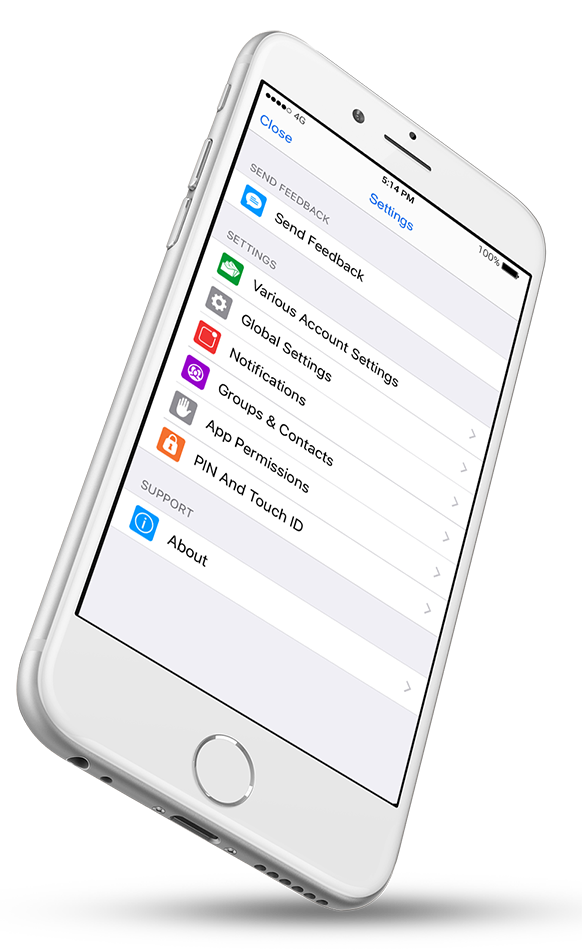
TypeApp combines rich capabilities through a simple design: letting you see the information you seek while enabling you to perform the actions required to process your emails.
You can use an account and filter picker, folder selection drawer, tabbed view for a traditional / people centric / task oriented or settings, bi-directional action swipes and More+ menu action to perform anything directly from the main view, active menus, floating action bars, tapping to dive into latest email, long tapping to multi-edit, image click to get into the cluster, synchronization status bar to track accounts and more. Our ongoing goal is to put all those goodies immediately available to you while maintaining our clean interface.


Impactful Design
We are all creatures of habits, so TypeApp fosters effective email habits letting you focus on the important things first. All the emails accessible with layered clusters. First glance allows you to see the bigger picture: what is happening in your inbox in a birds view and compact form. You then dive into a specific sender, group or service, and see all related conversations. Further deep dive lets you sift through all the specific emails getting all the details you need. The menus, images, swipes, and actions all serve the same purpose: putting all the power you need, literally at your fingertips, while letting you perform the workflows that meet your needs.
Avatars

Organized

Colorful


